This is the second post on some ideas about how one could possibly study the impact of misinformation on the ongoing COVID-19 pandemic. To be quite fair, I think that the overarching theme of this post and the previous one is to talk about causality and experimentation and techniques on how to “simulate” experiment with observational data.
Previously, we discussed some of the troubles associated with performing misinformation-related experiments. Here we turn to the observational approach, that is, where the data generation process was not carefully devised by the researcher. As this post deals with a very serious subject, it is worth a disclaimer: I am not a doctor or an epidemiologist, I am a Ph.D. student in computer science who works with social networks and observational studies. I know about causality and statistics but not about the medicine, virology, or public health. The only project I was ever involved in health only served to make me realize how ignorant I am. What I’m writing here is more of a series of incomplete thoughts than a rigorous research direction.
The Observational Approach
In this approach, a big advantage is that we would be able to track misinformation “in the wild”, that is, one could pre-select a large fraction of posts that are known to be false, and in our specific case, that downplay the risk of the pandemic, or the benefits of social distancing. Then, the second and perhaps more difficult step would be to link this data with the real world. That is, we would have to link this data to individuals (and then find who contracted the virus). Alternatively, one could link this data to geographical regions (for which we have aggregated statistics).
Once we had this data, we would need to make sure that we are really examining the influence of misinformation in the pandemic, and control for possible confounders. Let’s say, for example, that we are performing that study on Twitter in the Brazilian context. That is, we measure retweets on fake facts and miraculously are able to find a large number of geo-tagged users that were exposed to misinformation. We would then have two maps, one collected by public health authorities on the evolution of the disease and another collected by us, showing how fake news circulated on Twitter.
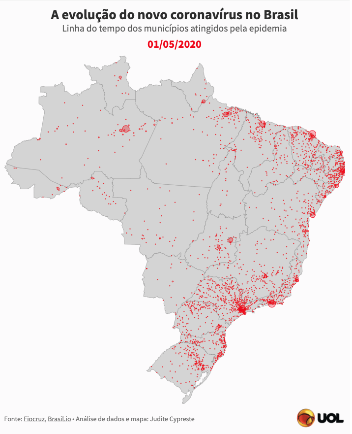 Example of geo-data available. Source: Uol
The question now is, if we compare these two maps, what could possibly be the issues with our research? Let us assume that the data collected by the health authorities is not biased, and let’s focus for a moment in the bias present in our collected data set. Simply put, the big issue here is: “Who uses Twitter in Brazil?” Clearly, the usage is not evenly distributed across all the population. For instance, it is quite possible that users of the platform are younger, richer, and more well educated compared to the Brazilian population. Also, it is likely and that they belong to more urbanized regions of Brazil, where access to the internet is more widespread.
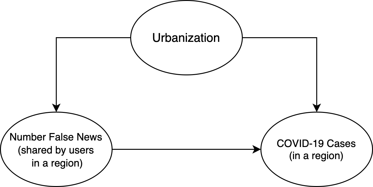 The simpler model I could come up with!
Ok, but why does this matter? Let’s consider the latest source of bias, urbanization. It could very well be that the most urbanized regions are the ones with the highest incidence of the disease (since, as a pandemic, population density is likely to play a role). If we try to model this (on the geographical level) with a causal graph (see below), this means that urbanization may influence both “engage with misinformation” and “number of COVID-19 infections”:
Thus, if we naively measure a “region’s engagement with misinformation on Twitter” and correlate it with the “number of COVID-19 infections”, we may in fact be measuring observe strong correlation in highly urbanized regions and low correlation in more rural areas. This means that any analysis performed would have to control for this confounder (and many others).
Other problems worth mentioning here include:
-
The pandemic is hard to model as the number of infected people grows exponentially. Thus, we would need to carefully compare places. For example, the disease has reached the countryside much later than the big cities in Brazil, and it would be unfair to compare one of the first places to report cases to somewhere where it took a long time for cases to be. Perhaps a good way to do this would be to compare the R0, rather than the total number of people.
-
Also in the same spirit, different places implement ted non-pharmaceutical interventions (e.g. lockdowns) at different times, and these need to be taken into consideration when doing the model. It would be unfair to compare a city in total lockdown with a city where there are no social distancing interventions.
-
Lastly, someone doing the analysis would need to be careful with spillover effects. That is, the “treatment” that we are studying (here “region’s engagement with misinformation on Twitter”) may actually cause an effect in neighbor regions. This is dangerous because we might under-estimate the effect given the interconnectedness of many regions.
Given these issues, some advice for the hypothetical researcher doing this research would be:
- To use the “Relative engagement with misinformation on Twitter”, which could probably account for the different levels of usage of Twitter;
- To somehow model “increase in R0” as the outcome rather than the total “number of COVID-19 infections”, which could help to address the fact that cities may be at different stages of the pandemic.
- To try to perform the analysis with regions that are far away from each other, and that is large enough so that spillover effects are diminished.
Overall, this discussion illustrates quite nicely why it is hard to come up with nice observational analyses! It is a constant exercise of trying to come up with a model, criticizing this model, and then trying to find a way to “dodge the bullet” and cleverly escape the issues you identified. After writing quite a bit about it, I frankly do not know if it is possible to come up with a good analysis of the impact of misinformation with the data that is available (or at least the data I assume is available).